Responsive design is the marketing buzzword of the century. Everyone wants it, but what exactly does it do? To put it simply, responsive design is laying out a website so that it resizes to fit the size of your screen. It can get a bit more complex with sections of your website that disappear on mobile, simplifying the content to its main point. An easy way to tell if a website is responsive is by resizing the width of your browser window and seeing if the sections begin to cascade on top of each other.
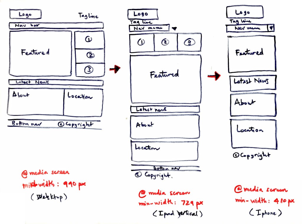
What’s the major difference between coding standard and responsive websites? The answer is simple: it’s media queries that allow your site to be responsive. Media queries are breakpoints in a website that tell it to change the layout at a certain width.
In the past it was common practice to create a mobile version of a website that would only load when viewed on a phone. After the dawn of tablets it didn’t make much sense to have two separate websites. This led to the concept of responsive design. As time goes on, there have been new technologies added that have increased the use of mobile users. This led to a whole new mode of thinking called mobile-first design. These new modes of thinking have changed the game of web design from an adaptive mindset to a modular thought process.
Now with the increasing demand for better SEO driven websites, Google has begun to put more emphasis on websites that are mobile-friendly.
Does your site feature responsive web design? At FSC Interactive, we can create custom website utilizing responsive design. Contact us to learn more.