
Yesterday, April 21, marked a momentous occasion in the world of SEO and web design: the so-called “Mobilegeddon” means that from here on out, Google will prioritize mobile-friendly, responsive websites in mobile search.
What does that mean for your website if it doesn’t already offer a mobile-friendly design? Can you immediately expect your site to fall off the face of the SERP cliff? Well, not exactly. It’s not too late to take action, but the sooner you can adjust to the changing digital landscape and offer a great experience for mobile device users, the better.
Here’s what you need to know:
What is “Mobilegeddon” and why should I care?
Google’s latest algorithm update, dubbed “Mobilegeddon” by some, is meant to give a rankings boost to mobile-friendly pages in Google searches that take place on mobile devices. This algorithm update is special because Google announced that this change was coming last February, giving webmasters nearly two months to prepare for the update.
This latest mobile-friendly algorithm should only affect mobile searches, not searches that take place from desktop computers or tablets.
How do I know if my website is mobile-friendly already?
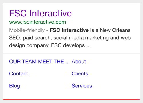
If your website has already been indexed by Google as mobile-friendly, it will show up in the search results with a mobile-friendly label. Google also offers mobile usability reports in Google Webmaster Tools, although updates to this information can be delayed somewhat. Additionally, developers can check out their sites using Google’s mobile-friendly testing tool, as well as read up on Google’s tips for how to avoid common mistakes when developing mobile websites.
Will my website drop in rankings immediately? If I update my site, how long will it take for changes to take affect?
The new algorithm picks up on changes in real time, but it may take a few weeks for it to roll out completely across the web, as Google will have to crawl your web pages to determine if they are mobile-friendly or not. The algorithm works on a page-by-page basis, so it is possible that your site may have some pages that are mobile-friendly and some that are not. Depending on the size of your website, it could take anywhere from a few hours up to a month for Google to fully index your site and update your rankings.
What’s better, a separate mobile site or a responsive website?
Responsive web design is leading the way and for good reason. Having a responsive website means you only have one website, not two separate sites to keep up with, as is the case with a mobile-specific design. Responsive web design also benefits more than just mobile users, as it automatically adjusts to fit many different desktop screens, tablets and mobile devices which all have different resolutions and sizes.
How do I find out how much of my website traffic currently comes from mobile devices?
Use a tool like Google Analytics to see how much of your traffic currently comes from mobile devices. Adjust accordingly – if you are a B2B company whose traffic spikes during the work week and dips off on the weekends, you may notice that the majority of your traffic also comes from desktop devices. But if yours is like most websites, you’ve likely seen a trend of ever increasing traffic from mobile devices, and you’ll need to make sure your website is responsive as soon as possible in order to keep up.
How do I get started with an updated, responsive web design?
Contact us today to learn more about how to bring your current website up to 2015 standards and create a responsive website that Google AND your customers are sure to love.